When we began organising our WordCamp, I agreed to adopt some design tasks including to design the logo.
Brief history about WordCamps in Switzerland
On 9.9.2017, the fifth WordCamp will take place in Switzerland. After last year’s WordCamp in Geneva, it will be the second time the Swiss WordCamp is named after the host city instead. This is why we couldn’t take the former WordCamp Switzerland logo and needed a new one.
Idea sketches
I started to collect ideas and made sketches. I was able to show these to my teammates and which we used as a base to make a decision. Obviously, the aim was to create a logo which presents the city of Bern as well as the WordPress community.
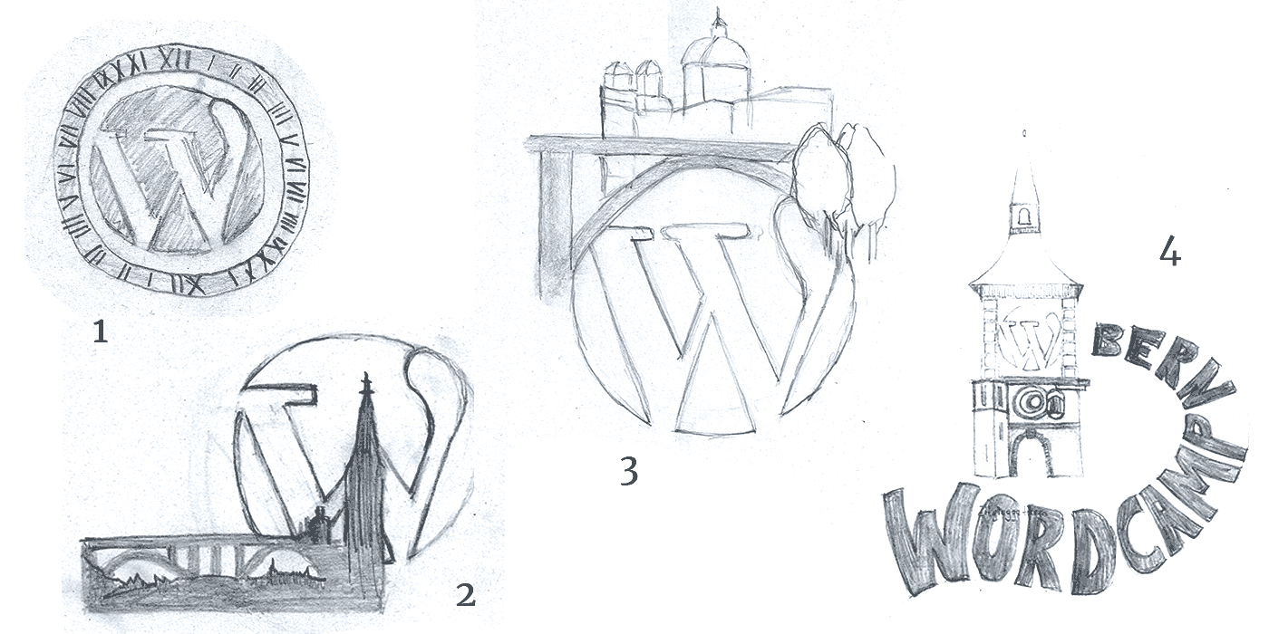
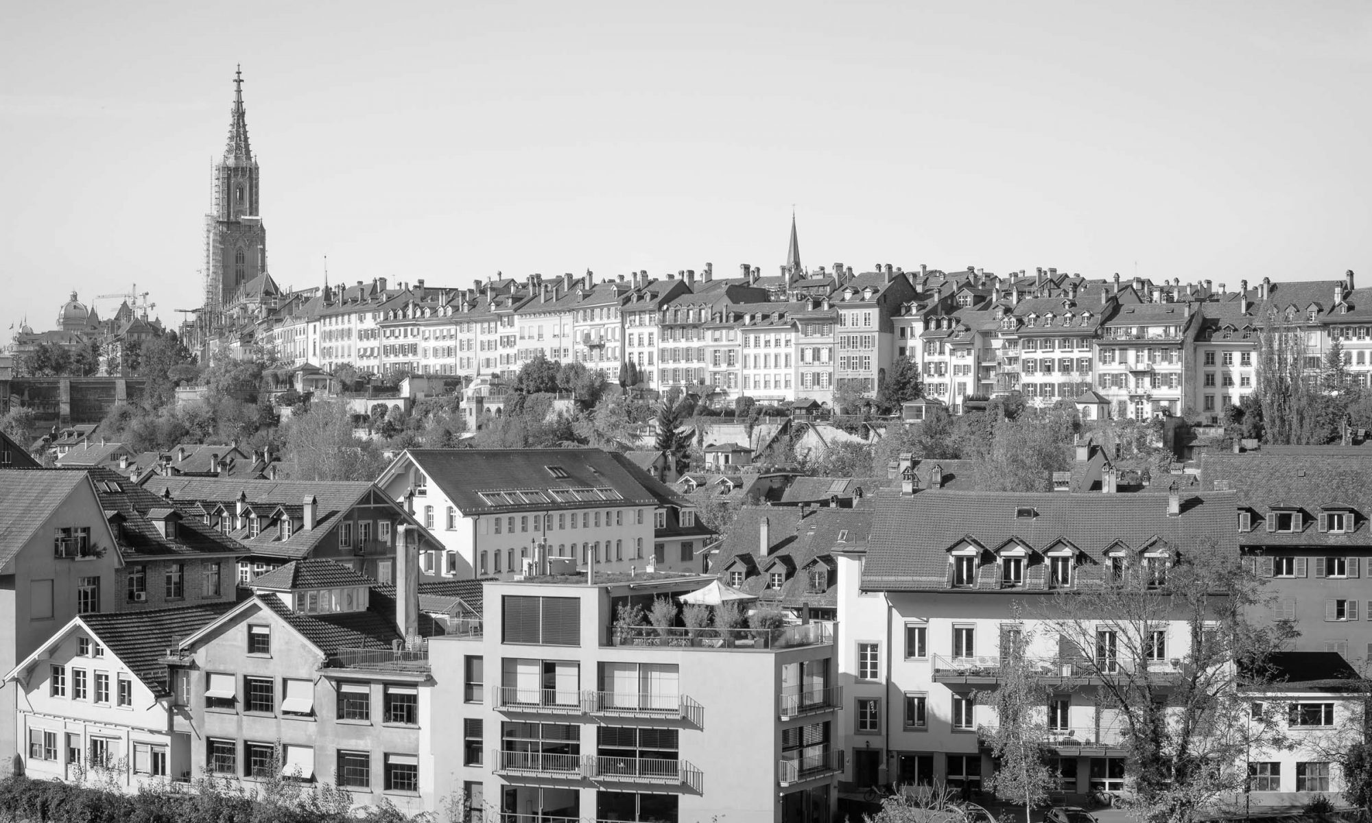
Ulrich had the idea to include the towns landmark “Zitgloggeturm” (a clock tower) or its artistic clock face. I tried this in sketch 1 and 4. As other WordCamps did it before, I tried to combine the WordPress logo and the panorama of the city (see sketch 2). For idea 3 I was inspired by the photo of Hurni Christoph. The image shows the Kirchenfeldbrücke bridge and the Bundeshaus (government building) and was taken down from the river Aare.
We decided to take the idea no. 3 further.
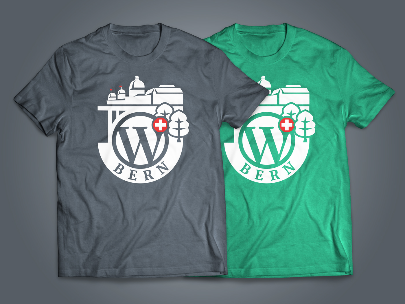
WordPress Switzerland logo
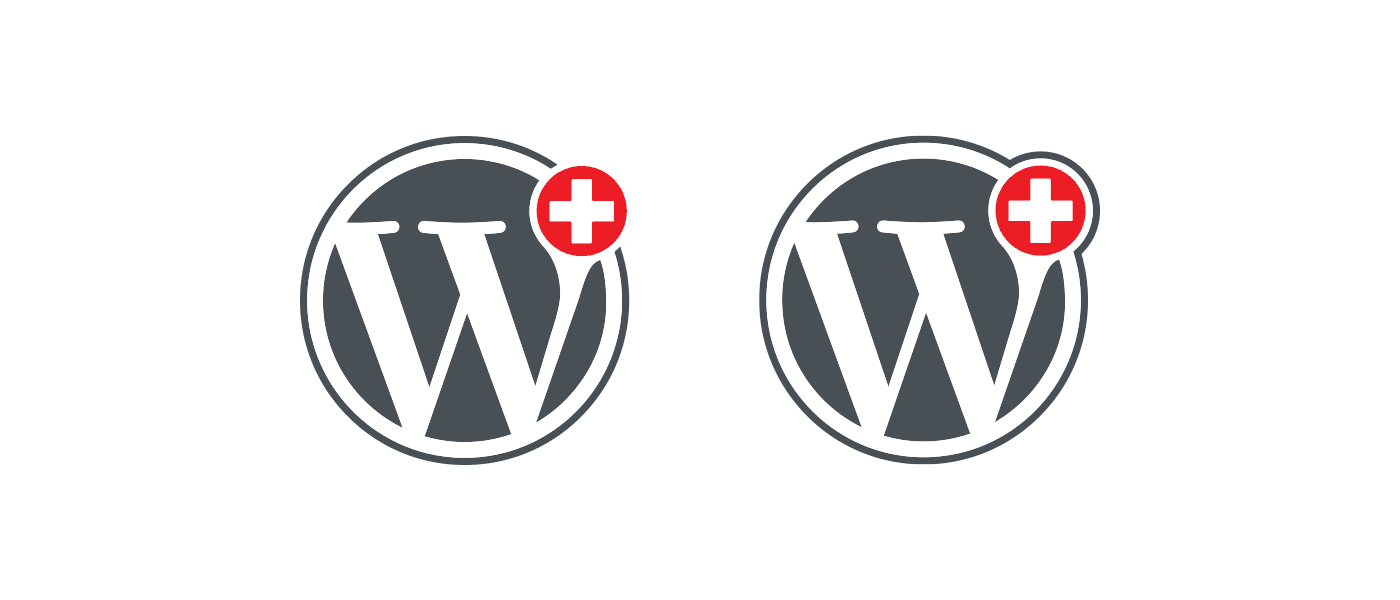
At the same time, I refreshed a former logo I made a few years ago for a Google+ group. Mark liked it and used it for the WordPress Slack and Github group. For this reason, I also included it in our WordCamp logo.
Implementation
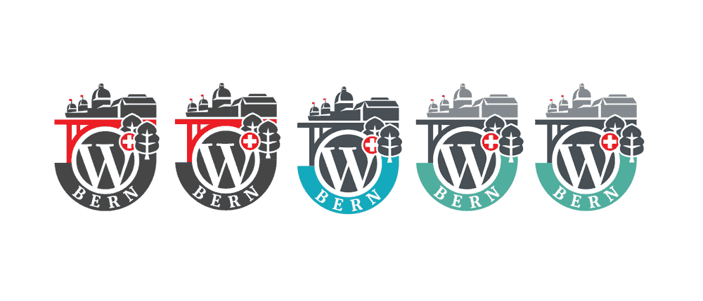
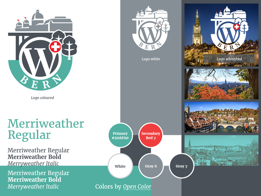
Once the decision was made, I started to make the idea an reality in Illustrator. The team liked the result. There were only a few corrections to made to do with the position of the Swiss cross. In addition, we had a few discussions about the colours.
Aare – Green
The final logo consists of the shade of greys #495057 and #868E96, the red #f03e3e for the Swiss cross and the green #50AFA0. There are also two negative versions in white or in white and the mentioned red.
Mark suggested the green which matches the colour of the river Aare. Moreover, the shape of the green represents the river, which loops round the beautiful old town.
Conclusion
I had a lot of fun designing the logo and design concept for our WordCamp. With this post, I hope I could show you that as well and that we accomplished it as a team.
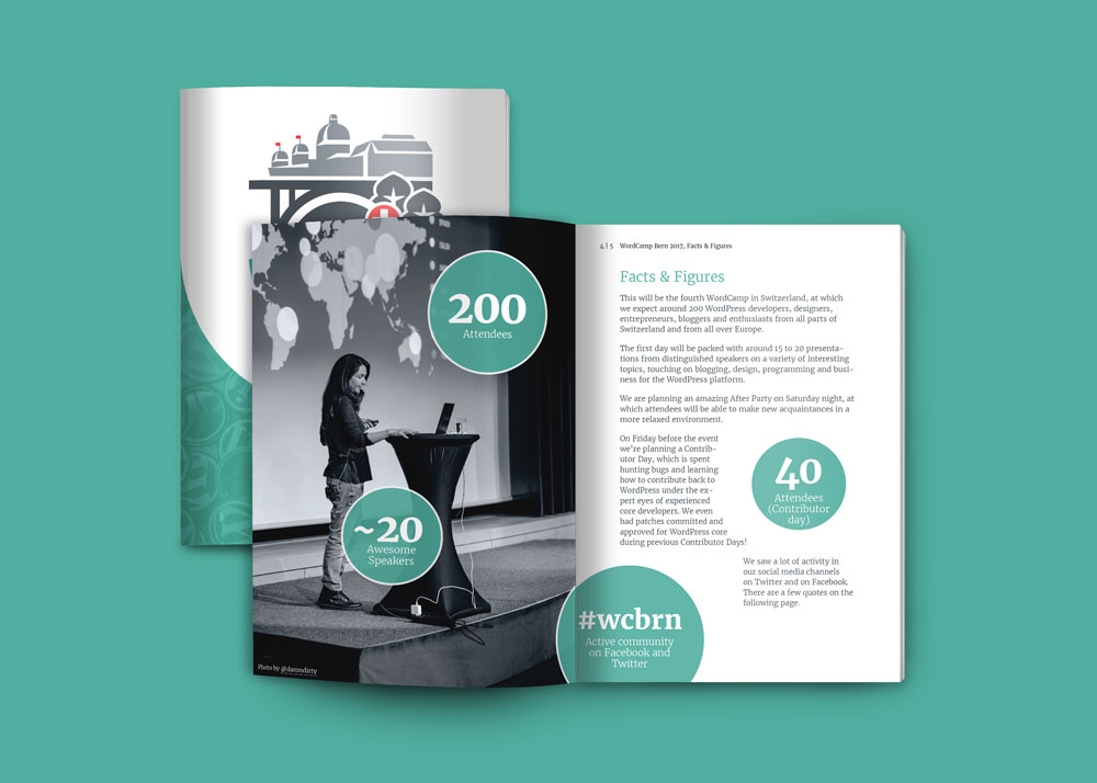
We also have made a new PDF factsheet to explain to our potential sponsors what this event is all about.